

Client : 力の源カンパニー
Date : 2005
Url : http://www.chikaranomoto.com/
CI, VI, Symbols, Logotypes, Typefaces, Book/Editorial Design, Package Design, Motion Graphics, CM
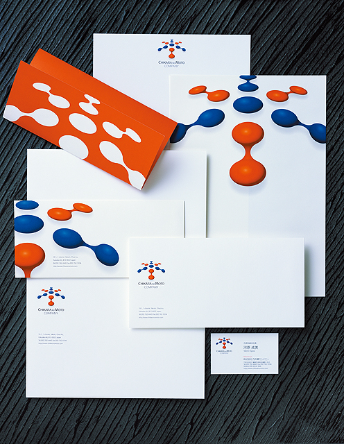
The interlocking segments of this logo also represent the kanji character which stands for "a person." In this way, the design symbolizes the strength of each employee united in the organization. From dot to line, line to plane, and plane rising to a dome in the third dimension, the highly evolved character of this company's business is also expressed in passionate red and intellectual blue. Publications Graphis Design Annual (2006)
CREDIT
March 02, 2011 15:07:17
